Excel to Graph Generator

Draw line, bar, scatter, pie and radar charts from a spreadsheet, without uploading it.

100% Browser-Based Local Processing
Drop a spreadsheet, or click to choose one .xlsx, .xlsm, .xls and .csv. Read in this tab, never uploaded.
Columns
Y axis
Style
Chart

One sheet at a time. The file, the chart and both exports are made in this tab, so nothing is uploaded. A merged cell is drawn as a break in the series, never joined across.

Privacy Focused

Local Processing. The values you enter never leave your device.

Instant Results

Fully Client-Side. Runs instantly in your browser.

No Signup

No accounts. No API keys. Just open and use.

Browser Based

No installs, no sign-ups, no conversion limits.

Charts from a spreadsheet, without uploading it

This generator reads an Excel or CSV file and draws line, bar, scatter, pie or radar charts from the columns you choose, without sending the file anywhere. Pick one column for the X axis and as many as you need for Y. Charts export as a PNG, or as a PDF that can hold all five chart types for the same data in one document. There is no account and no upload step. It keeps working with the network switched off, which is not something a tool that uploads your spreadsheet can do.

The Y axis takes more than one column. Select several and each becomes its own series on the same axes, which is the ordinary case for a sheet where every month or every region sits in its own column. Selected columns show as chips, so you can drop one without clearing the lot and starting over.

The PDF export carries an option worth knowing about. Turn on "include all chart types" and one document comes out holding the same data drawn five ways, line through radar. It is the quickest way to find out which shape actually suits your numbers, and it beats exporting five images and assembling them by hand. The option is off by default, so a normal export is still one chart.

Dates on the X axis come out of the file as serial numbers. A cell showing 2024-01-01 is stored as 45292, and the generator formats date-formatted cells for the axis, so a column that still shows raw numbers was never formatted as a date in the spreadsheet. The Excel serial date converter explains that numbering. If you want the grid itself as text rather than a picture, the Excel to Markdown table converter reads the same file.

How to make a chart from an Excel file

Five steps, and none of them involves an account.

Step 1: Load your file. Drop an .xlsx, .xls or .csv file onto the page, or browse for one.

It is parsed in your browser.

A multi-sheet workbook lets you pick the sheet before anything else, since the columns you can chart depend on which sheet you are in.

Step 2: Choose the X axis column. One column, and it is usually the labels: dates, months, names, categories.

If it holds dates that were formatted as dates in the spreadsheet, the axis shows them as dates.

If they were typed as plain numbers, format them in the source and reload, because the file is the only place that information exists.

Step 3: Add the Y axis columns. Pick one or several. Each becomes a series, and each appears as a chip you can remove.

A sheet with twelve monthly columns charts as twelve series in one click.

Dropping the ones you do not want is faster than selecting the ones you do.

Step 4: Pick the chart type and tune it. Line and bar cover most sheets.

Scatter is for two numeric columns where you want a relationship rather than a trend. Pie only makes sense when the values are parts of one whole.

Choose a palette, switch grid lines off for a cleaner export, and turn smoothing on if a noisy line is hiding its own shape.

Step 5: Export a PNG or a PDF. PNG gives you the chart as it appears; PDF gives you a document.

With "include all chart types" switched on it gives you the same data drawn five ways in one file.

Both are generated in the page, so the export is as private as the chart was.

Excel to Graph Generator in action

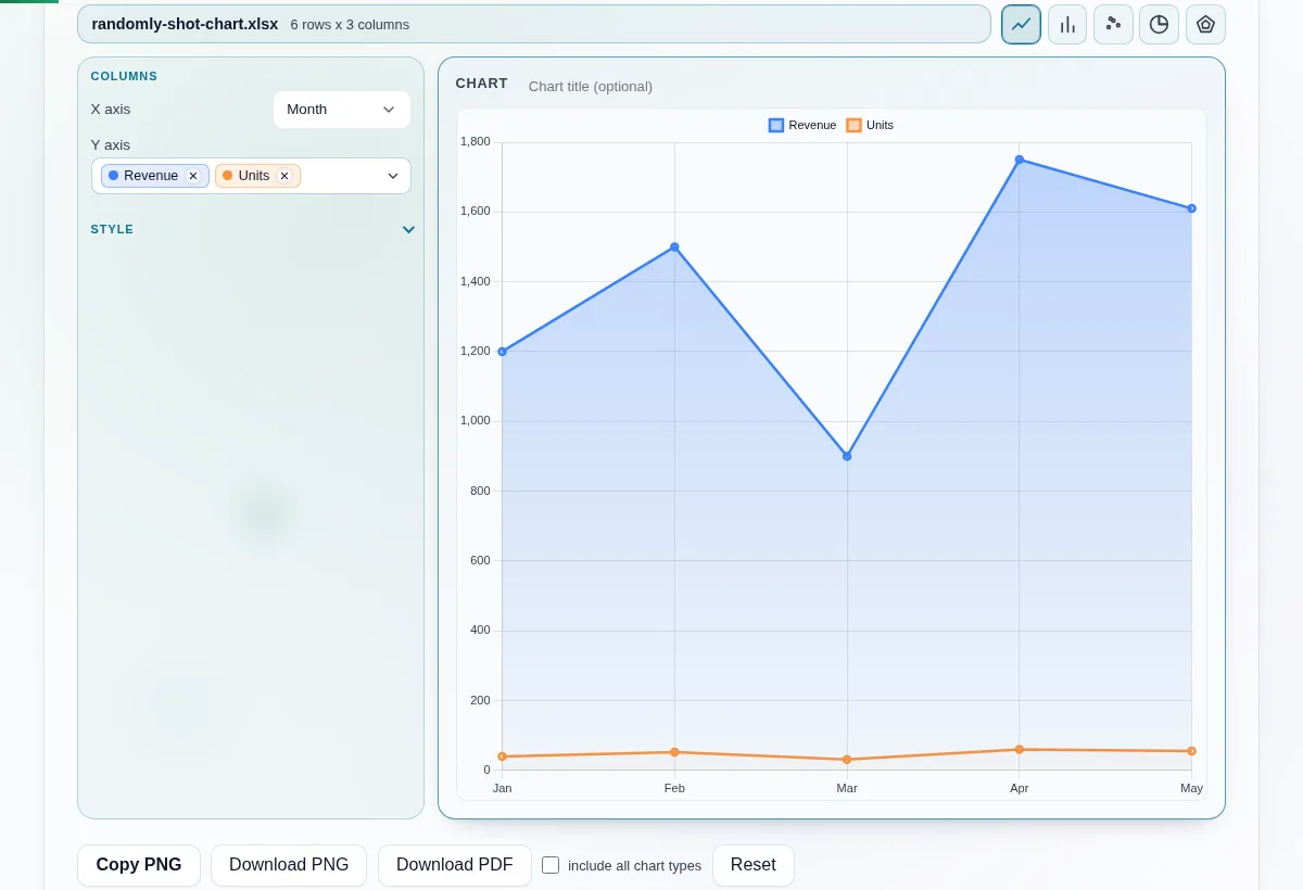
Excel to graph generator showing a loaded spreadsheet, column selectors, and a multi-series line chart on a canvas.
Two columns selected as separate series, drawn as one line chart
A pie chart refused because two Y columns were selected, with a button offering to switch to a bar chart.
A pie chart shows one series, so two selected columns are refused with the fix offered
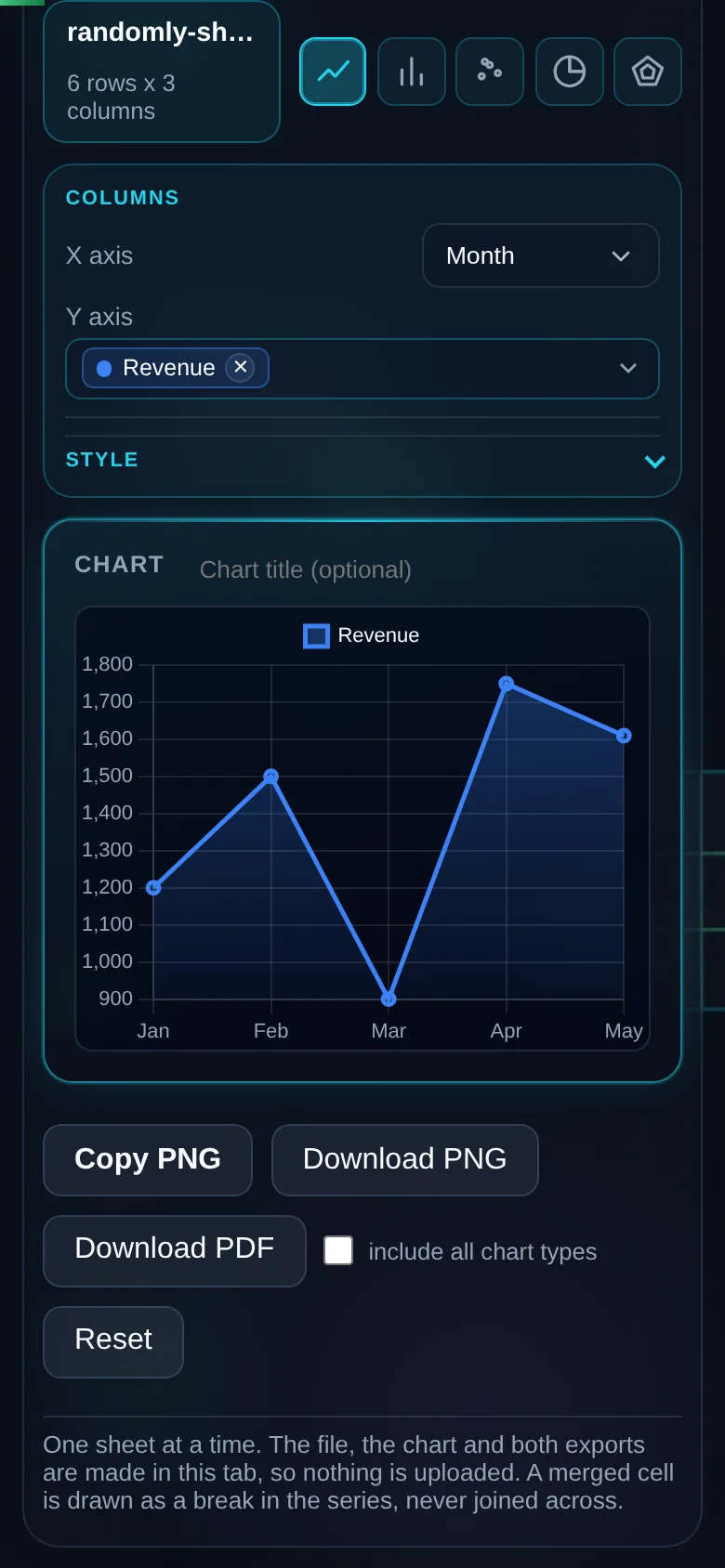
The same graph generator on a 390 pixel phone screen, with the five chart-type buttons, the axis pickers and the chart stacked in one column.
The same tool on a phone, chart and controls stacked

Frequently Asked Questions

Which chart types can it draw?

Five: line, bar, scatter, pie and radar. Line and bar cover most sheets.

Scatter is for two numeric columns where you are looking for a relationship rather than a trend over time. Pie works only when your values are parts of one whole. Radar suits comparing several measures across a small number of items, and it gets unreadable past about eight.

Can I plot more than one column at once?

Yes. The Y axis takes as many columns as you select and each one becomes its own series on the same axes.

That is the ordinary case for a sheet where every month or every region is a column. Selected columns appear as chips, so you can remove one without clearing the whole selection and starting again. The X axis takes one column.

What file types does it read?

Excel workbooks and CSV files. .xlsx, .xls and .csv all load the same way.

A multi-sheet workbook lets you pick the sheet before you choose columns. If the file is not something the parser recognises, it says so and names the extension it saw, rather than drawing an empty chart and leaving you to work out why. Nothing is sent anywhere at any point.

What does "include all chart types" do in the PDF export?

It puts the same data into one PDF drawn five different ways, line through radar.

Instead of exporting five images and assembling them yourself, you get a single document to scroll through and see which shape actually suits your numbers. It is the fastest way to answer that question, and the option is off by default so a normal export stays one chart.

Can I change the colours?

Two palettes are built in, Primary and Pastel.

Primary is the higher-contrast set and it is what you want for a projector or a printed page. Pastel is easier on screen when several series overlap. You can also switch the grid lines off and turn line smoothing on, which changes how a noisy series reads without changing the numbers behind it.

Does it work offline?

Yes, once the page has loaded.

Everything that draws a chart runs in your browser, so there is no request to fail when the connection drops. Load the page while you have a network, then disconnect and keep working. That is also the simplest way to check the privacy claim yourself, because a tool that needed to upload your file would stop.

Why are my dates showing as numbers on the X axis?

Because that is how the file stores them. Excel keeps a date as a serial number counted from its own epoch, so 2024-01-01 is really 45292 on disk.

The generator formats date-formatted cells for the axis. If a column still shows numbers, those cells were never formatted as dates in the spreadsheet, and formatting them there fixes the axis here.

Is my spreadsheet uploaded anywhere?

No, and there is nowhere for it to go. The file is parsed in your browser, the chart is drawn on a canvas in the same page, and the PNG and PDF are produced there too.

No account, no sign-in and nothing stored on this site. You can watch the network tab stay empty for the whole session, which is the point of building it this way.